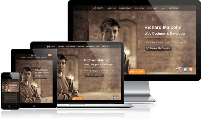
Responsive Design
With Content In Mind
I believe great photography can really add to the professionalism of a website. This is even better if it truly relates to the content so I went about incorporating original content and imagery to every page. I believe this genuinely adds more personality to what would had been a clean but rather sterile looking website.
During the conceptual design stage of this project I decided to break away from the typical website design and went about incorporating a unique personality to every page whilst maintaining a consistent layout to ensure a coherent user experience. Furthermore, I went about eliminating as much repetitive content as possible for the purpose of engaging the user through new content and shifting the users focus onto main content areas.
In order to create a unique user experience an array of rich interactive elements have been developed to enable users to quickly access content without constant page loading through the utilisation of AJAX and PHP. To keep up with the times this website utilises the emerging standards in web development including HTML5, responsive design, and progressive enhancement to ensure the website is accessible through multiple variety of devices.
This website has been designed and developed by Richard Malcolm from scratch. Accompanying photography within this website has been produced by myself with the kind assistance of a fellow photography enthusiast: Matthew Newman.
Visit responsinator to see just how responsive this website is.
Technologies used to create this website include: HTML5, CSS3, JavaScript, JQuery, AJAX, PHP, MySQL, Grunt and SASS